Before Norman Rockwell, A Gay Artist Defined the Perfect American Male
by Hunter Oatman-Stanford | August 28th, 2012
http://www.collectorsweekly.com/articles/the-perfect-american-male/
Nobody had to tell J.C. Leyendecker that sex sells. Before the conservative backlash of the mid-20th century, the American public celebrated his images of sleek muscle-men, whose glistening homo-eroticism adorned endless magazine covers. Yet Leyendecker’s name is almost forgotten, whitewashed over by Norman Rockwell’s legacy of tame, small-town Americana.
Rockwell was just an 11-year old kid when Leyendecker created the legendary “Arrow Collar Man” in 1905, used to advertise the clothing company’s miraculous detachable collars. One of America’s first recognizable sex symbols, this icon of masculinity was defined by his poise and perfection, whether on the sports field or at the dinner table. Like the Gibson Girl, the Arrow Collar Man developed a singular identity, equal parts jock and dandy, who supposedly received more fan letters than silent film heartthrob Rudolph Valentino. To top things off, Leyendecker’s men were often modeled after his lover and lifetime companion, Charles Beach, making their secret romance a front-page feature across the U.S.
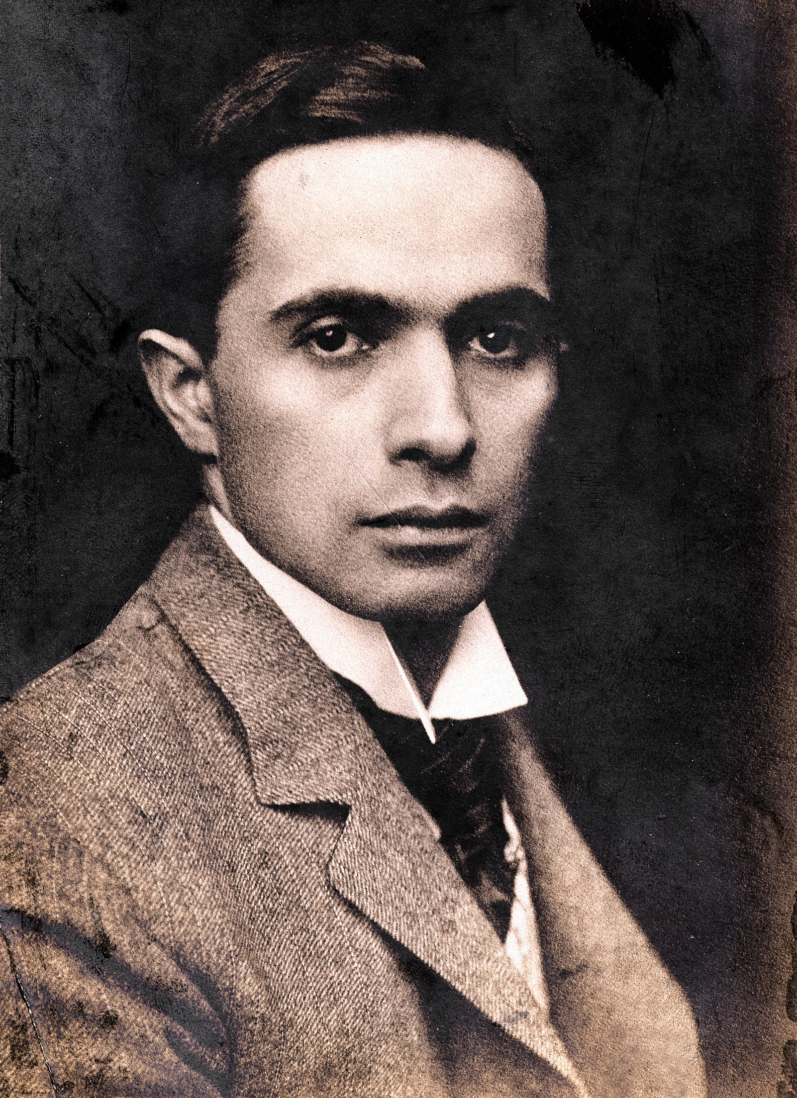
J.C. Leyendecker in 1895.
Born in 1874, Joseph Christian Leyendecker emigrated with his family from Germany to Chicago in 1882 and soon began apprenticing with illustrators. After a brief stint studying art in Paris, Leyendecker returned to Chicago, where he established relationships with renowned magazines like “Collier’s” and “The Saturday Evening Post,” for whom he would ultimately design 322 covers. (To view more Leyendecker images, see our slideshow.)
While Leyendecker was also known for his depictions of apple-cheeked children and elegant women, it was his stern, brooding men who created the greatest impact. With their strong jaws and perfectly tailored clothes, Leyendecker’s men were featured in the pages ofnewspapers and magazines across the globe, selling everything from luxury automobiles to socks. Leyendecker’s fictional world of affluence and beauty influenced other pop-culture touchstones, like the fantastic setting of F. Scott Fitzgerald’s “The Great Gatsby.”
As fashions changed and the U.S. entered World War II, Leyendecker’s career slumped, curbing his extravagant lifestyle. After his death of a heart attack in 1951, Leyendecker left few assets for his partner, Charles Beach, and many of his original paintings were sold at a rummage sale for $75 each. Alfredo Villanueva-Collado, a former literature professor at the City University of New York and established collector of Bohemian art glass, filled us in on his J.C. Leyendecker collection and the fascinating story behind this oft-neglected male image maker.

This 1932 Leyendecker cover image for the “Saturday Evening Post” literally puts the near-naked male on a pedestal.
Collectors Weekly: How did you first discover J.C. Leyendecker?
Villanueva-Collado: My partner was a graphic artist, and when we first arrived to the U.S. we were really into the Arts and Crafts movement. But, of course, his thing was graphics, and when we started researching, we found out there was life before Norman Rockwell. And then we found out what kind of life, and we went, “What? Leyendecker’s gay? No, it can’t be.” It freaked me out, and I’ve never been in the closet.
“This man had the gall to make his lover the icon of American masculinity.”
I first realized Leyendecker was gay from the subtext, and then went looking for evidence through my research, and the evidence was there. It was often mentioned in passing, since the intimate details only came out later. Leyendecker knew very well he couldn’t break barriers; he could only suggest the subject.
As a literature professor, I was fascinated by the semiotics of Leyendecker’s images, because I know a lot of gay artists had to use what I call the “palimpsest technique.” Palimpsest refers to the fact that parchment used to be so expensive they would have to paint it over to write something new, and that is the essence of semiotics, the text that is hidden beneath the visible text. Especially in literature, in anything having to do with gays, it’s been done to perfection. You have to hide it, not expose it like you can today.

In this 1907 Leyendecker painting for Arrow dress shirts, all eyes lead to the dapper man in brown.
Leyendecker had a fascination with asses, with muscles, and it was so evident. I kept wondering, how come nobody else says this? It’s right in your face, for heaven’s sake. I found it extremely interesting that there were three brothers–of which both Frank and J.C. turned out gay–and a sister, Augusta, who never married.
Both of the Leyendecker brothers were in Paris at a very crucial moment in 1884. They absorbed the academic French way of drawing, but it was also the time when Baron Von Gloeden’s photographs were all over the place. Von Gloeden was gay and also idolized the masculine body. This went contrary to the contemporary worshipping of the female body as a siren or as a vampire, and foretold–I hate to say–the Nazi aesthetic, the worship of the male body. But they didn’t know that, and that was not their intention.
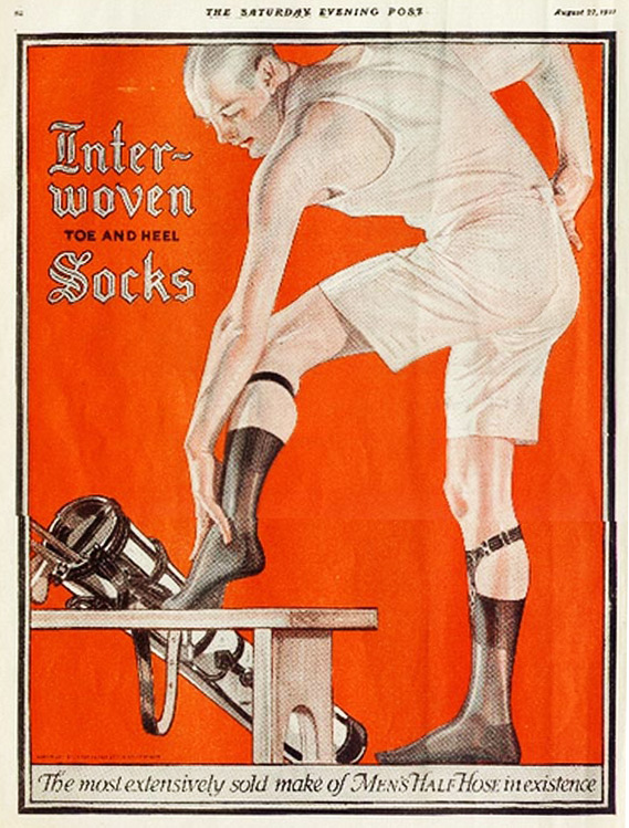
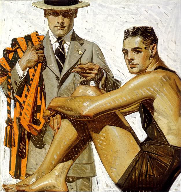
Who knew socks could seem so sexy? Interwoven advertisement, circa 1927.
When I first started collecting Leyendecker, I bought whatever was offered; I wanted the image. In fact, many times I bought the entire magazine. Most people do not realize it, but the “Saturday Evening Post” was an extremely right-wing publication. You should see the articles against the New Deal. But they have fascinating images.
I wasn’t buying Leyendecker’s work because I knew it would go up in price; I was buying it because I became obsessed with this man who had the gall to make his lover the icon of American masculinity. I was very interested in the construction of the masculine subject, and it gave me no end of tickles that the man who created icons like the Arrow man and the Chesterfield man was gay.
But I think that the ultimate finger in the eye was the Lady Liberty poster from World War I [see slideshow]. Beach is both the lady and the Boy Scout, and considering what’s going on today with the Boy Scouts, it’s amazing. Paul Ryan would be a Leyendecker boy!
Collectors Weekly: When did Leyendecker first paint Charles Beach?
Villanueva-Collado: J.C. was 29, but Beach, who must have been quite a hunk, was only 17. For the first few years, the brothers kept an apartment here in New York, and Beach had some kind of residence nearby. But then when the Leyendeckers moved to their mansion in New Rochelle in 1914, which J.C. had built, Beach moved in with them. Their sister, Augusta, apparently hated him from the moment she saw him. Beach not only became Leyendecker’s favorite model but also the man who ran the household, and their relationship lasted 50 years.
They hosted these crazy 1920s Belle Epoch parties that Beach organized, and the crème de la crème of New York society went there. I was totally flabbergasted when I found references in “The Great Gatsby.” Then I found out that people like Fredric March, George Hamilton, and a lot of other very famous males posed for Leyendecker.
And then, of course, Leyendecker’s sexuality should have been very clear with his Interwoven Sock ads, which Beach posed for. When I first posted these images on Collectors Weekly, I said “I’m going to get into real trouble now” because you don’t debunk an idol. But this is not debunking; this is what he was.
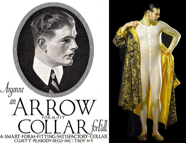
Left, an early Arrow advertisement circa 1910 and right, a 1915 painting for Cooper Union Suits, both modeled by Leyendecker’s partner, Charles Beach.
What were some of Leyendecker’s other major advertising campaigns?
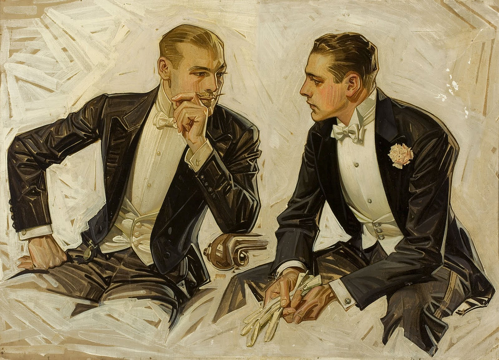
Villanueva-Collado: Leyendecker also did Kellogg’s; he did Karo Syrup; he did Maxwell’s Coffee. He did some hysterical advertising for Gillette [see slideshow]. And Kuppenheimer clothing, of course, that was enormous. He did Chesterfield cigarettes and then posters for both wars.

Cleanliness is next to godliness: This atypical Ivory Soap advertisement from 1922 features a priest.
In his Ivory Soap commercials, there are these languid column-like figures, very statuesque pseudo-brothers or priests. This monk is holding up a bar of soap. The text reads, “Ivory Soap: It floats.” Since when do you use a man to sell soap?
There’s one ad that I adore, a fabric called “Trojan Weave” created for Kuppenheimer, which appeared on April 29, 1927. In this ad, there’s a Greek warrior for strength and a Greek maiden for beauty. For the longest time, I was puzzled by the “Trojan Weave” advertisement, and I was specifically intrigued by the “Trojan” warrior on the left, since Trojans are also condoms.
A friend of mine found a fascinating Internet posting called Leyendecker Studies, which included originals for both sides of the Kuppenheimer ad. In the Trojan warrior study, I noticed the helmet bore no crest. But in the finished Kuppenheimer advertisement for “Trojan Weave,” it does feature a crest, immediately below the word “Trojan.” While researching the history of Trojan condoms I found out they hit the market at the beginning of 1927. One detail caught my attention: the maker’s stated purpose to eschew overt or offensive sexual references, so the logo was to be a simple Trojan helmet, implying strength and protection. I looked for images of the packaging. Even today, a crested helmet is their logo!
Therefore, it can be assumed that in 1927 Leyendecker changed his Trojan warrior’s helmet, adding the crest as a sly reference to the new latex condom that had just hit the market. Talk about semiotics and palimpsests.
I’m amazed that this particular artist was able to get away with so much, as the foremost male image maker of the ’20s and ’30s. The American people swore by these images, and the Arrow Collar Man received fan letters by the ton from women. But the gays were probably petrified.

Some of Leyendecker’s most monumental works were for the Kuppenheimer clothing company. The men in this 1929 ad, all resembling Charles Beach, seem to be paying more attention to each other than their gorgeous mermaid friend.
Collectors Weekly: What was the connection between Norman Rockwell and J.C. Leyendecker?
Villanueva-Collado: Norman Rockwell worshipped Leyendecker, but bad-mouthed him to death in his own biography. He was especially cruel to Beach, whom everybody seemed to hate because he was too good-looking, too prepossessing.
In terms of my research, I’ve been trying to find illustrators that were doing covers at the same time Leyendecker was. And it’s very interesting; all of the Leyendecker landmarks were copied by the other illustrators, including Rockwell. Somebody ought to dethrone Rockwell and do a study of Leyendecker’s influence on him.
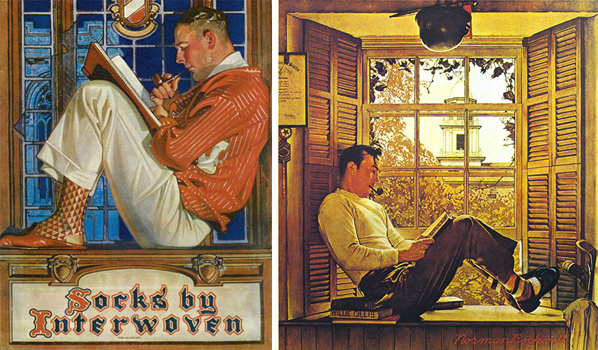
J.C. Leyendecker’s illustration for Interwoven Socks from 1921 and Norman Rockwell’s “G.I. Bill” from 1947 show striking similarities.
Collectors Weekly: Is there a larger art-world stigma against illustration?
Villanueva-Collado: There definitely is a stigma. The Met has never touched so-called commercial art. I find it totally insulting that the American wing of the Met does not have him anywhere. The American wing of the Met does not have anything relating to American illustration, and if they do, it’s not out, not even Rockwell. This is such an important part of American art.
These were all paintings. Leyendecker did not work from photographs, like Maxwell Parrish did. He had a live model in his studio, adjusted the light, painted the canvas and then the canvas was reproduced. Forget about today’s technology. He was a painter, an illustrator.
Collectors Weekly: How would you describe Leyendecker’s imagery?
Villanueva-Collado: Well, it’s very interesting because President Roosevelt called these images of American males “the commoner.” But this is not the commoner. This is the American macho male before his aggrandizement as a killing machine. His soldiers, beautiful as they are, are always shown helping others, saving others. It was the Doughboy image, the World War II image.
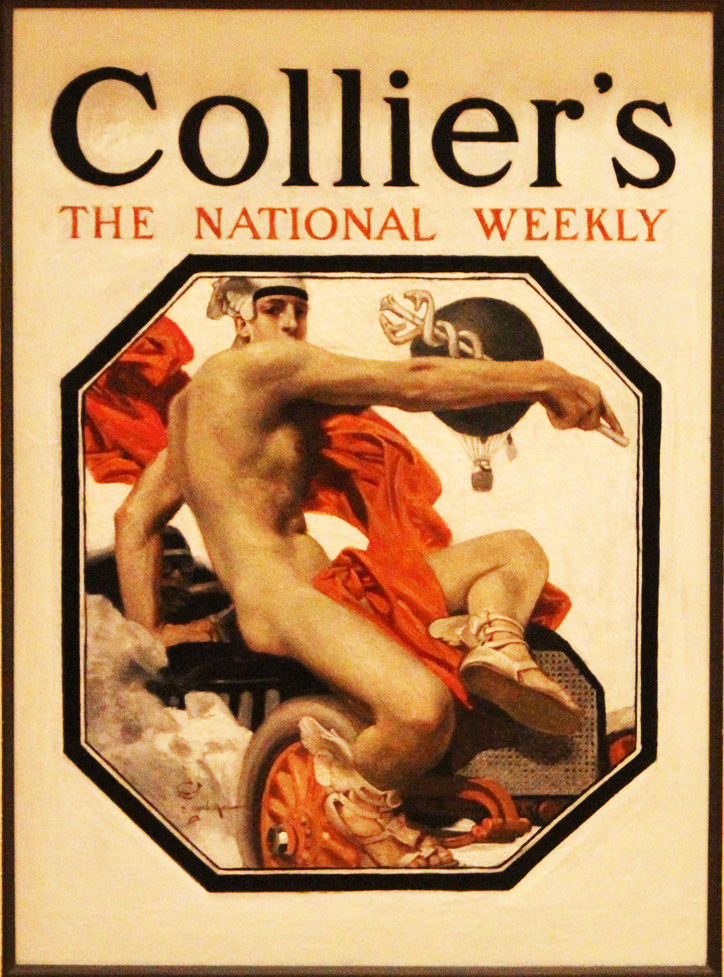
Leyendecker’s painting of Mercury, the god of speed, for Collier’s in 1907 draws from classical sculpture.
His sportsmen aren’t really competitors. They were an image of the American male as huge and beautiful, but not threatening. Even in those incredible World War I posters, especially the ones with sailors, there was a real subtext of sexuality there. It seems that the Navy has had this reputation for all of its existence.
But there was no coarseness. These people were not tattooed. They had no piercings. They were normal people blown to heroic Greek proportions. His cover for “Collier’s” of the God of Speed is totally Roman. You look at these people and you are also looking their connection with the heroes or the gods of antiquity.
His females are always funny: In classic marriage pictures, the male is traditionally standing up and the woman is sitting down. His are exactly the opposite. She’s always standing up with her hand on his shoulder. The 1931 cover for the 4th of July, which I love, is this woman talking and this patriot with his hands up and yarn tied around them. He stood common images on their heads.
His pictures of black people are fascinating. He never went overboard with sympathy–they were still submissive–but it would send a clear message. Nothing sadder than the little boy dressed up in military garb being dusted off by a black porter [see slideshow]. Who is the boy in this picture? Porters were called “boys,” so the boy is the old black man. The images hurt once you really read them.
Leyendecker’s distinct cross-hatch style is seen in this 1911 painting for Cluett Dress shirts, featuring a particularly intimate gaze between two gentlemen.
Collectors Weekly: Do you think all the nudity shocked people?

This gorgeous Art-Deco style illustration from 1929 shows Spring represented as a Greek god.
Villanueva-Collado: No, because that was seen as Art. Many sculptures of the period by American artists trained in France have these massive masculine bodies. What you do not find in Leyendecker’s work is the naked female body. It is never shown anywhere. And it’s interesting because one of his influences was Alphonse Mucha, who did many semi-exposed women, but Leyendecker did not. I’ve looked at enough of his work to say this with a degree of certainty.
Interestingly enough, nudity in art was far more accepted in that early period than it would be by the American puritans in the robotic period of the ’50s. Women had a lot of freedom during World War II, but once their husbands came back home, they were housewives again. It was not until the ’60s that the thing exploded.
Probably my favorite magazine cover is this picture of this monster of a puritan, this fat pilgrim with a wig, and carrying a gun and a Bible [see slideshow]. You couldn’t say it clearer. He portrayed the Tea Party 70 years before it became a reality. It’s there for all of us to see. And I know that a lot of my friends, even the most liberal ones kind of say “Oh my god, did he actually do that?”
Collectors Weekly: What kind of long-term influence have his images had?
Villanueva-Collado: He definitely changed advertising. He broke with the rectangular format. Before, the lettering had to be at the top, but he broke the lettering with these circles that he borrowed from Japanese design.
I’m not a graphic artist, but I know Leyendecker did something to these covers that nobody else had done. Covers had a format and he did away with it. He put provocative covers on these magazines. Leyendecker’s four last war covers are obscene.
To me, to have a naked baby with a helmet and a bayonet going after a swastika is–I don’t want to sound prudish–but it’s too much. That was actually the very last cover ever created for “Saturday Evening Post.” It tells you more than you want to know about how he viewed American culture.
CLICK ON SLIDE SHOW LINK TO SEE MORE: see slideshow
No comments:
Post a Comment